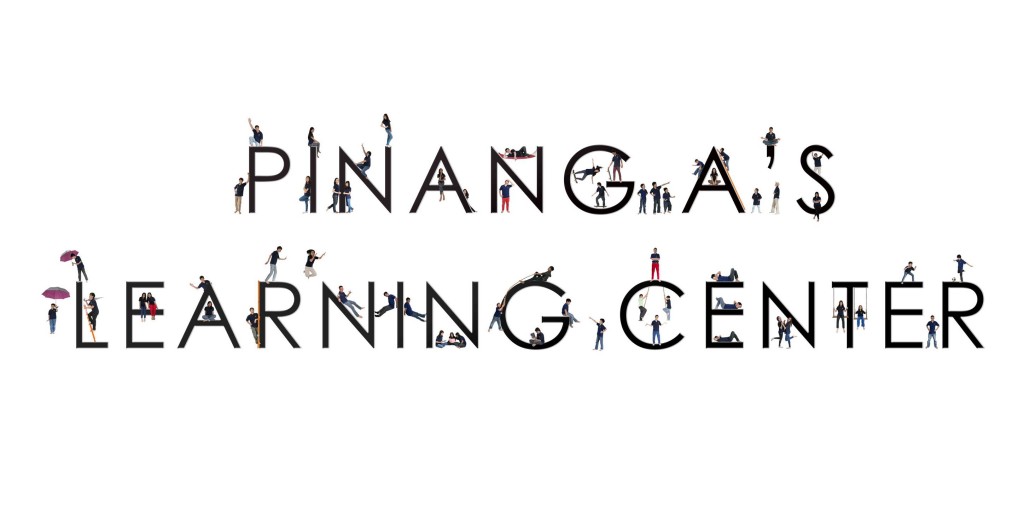

Pinang A's Banner - Bigger sizes available HERE
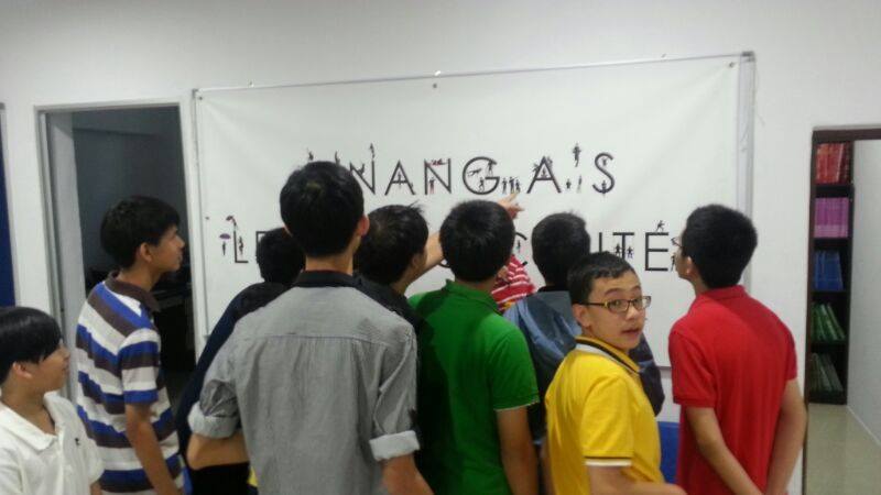
We had a large notice board to fill in the hall of the main-entrance. Of course our initial thought was to have notices, announcements and little pin-ups of our homeschool activities.
One day, an idea popped up. It seemed like a better choice. A simple , uncluttered-minimalist, yet cool and fun banner, that people would actually take time looking at.
As with all art, it starts with an idea, pre-visualization and concept, then planing and execution.
I started with a printout of the actual fonts that was going to be used, and sketching down the "children" in the poses / activities, labeling them with their names.
Photography wise, the lighting for the children had to be neutral, with flash diffused through umbrellas from both sides. A normal-focal length was used - 50mm, for all shots. Exposures were also constant with each frame. Each picture had to be taken at the relatively same height and distance to reduce differences in the angle-of-view.
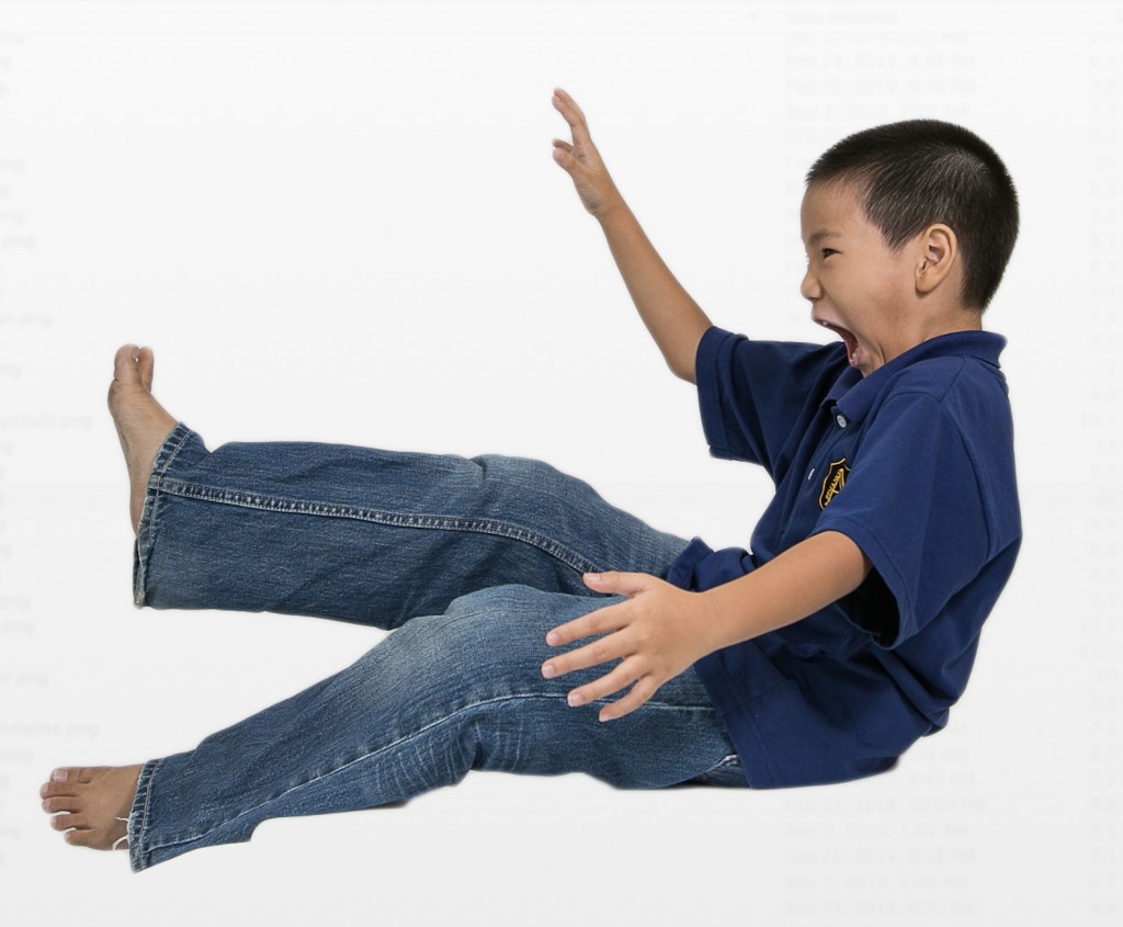
The most challenging part was actually directing the kids. Asking them to imagine to look at' something' or 'someone' and expressing happiness, fun, frustration, etc for the shots. But kids being kids, they have vivid imagination and it didn't take too long to get the shot.

In Gabby's case, his expression was "Excitement and slightly afraid" because "you're going down a BIG water slide!". Well done gabby !
After getting the shots, it required some work in cutting them out in photoshop and positioning them in a LARGE document. This step was rather time consuming.
When done, the photo was sent to a printer, and when we had it delivered to us, it was all worth it!

The JPEG in multiple file sizes are available HERE